Case Study: Wine Chronicle
Wine Chronicle is a FileMaker Pro-based application used by wine collectors to track their cellars.
PROBLEM
There was a fear in our household that I would return home one day to find that a rare and/or expensive bottle of wine had just been consumed inadvertently. With pizza. Without me.FIRST THOUGHT Find an off-the-shelf application. A quick search of available wine cellar management applications found the following; very few ran on the Macintosh, most were poorly designed in terms of their interface and usability. Mostly, I couldn't find one that I liked.

SOLUTION Create my own.
Originally Wine Chronicle was going to be for my personal use. After several friends saw the database they suggested that I could sell it online. After adding features, improving the interface and usability, Wine Chronicle was born and introduced to the world via www.winechronicle.com.
Wine Chronicle was developed with FileMaker Pro 6. FileMaker was chosen for several reasons;
- Cross platform - both Macintosh and Windows could be supported with the same code-base
- Rapid development - FileMaker is extremely fast to develop in, allowing products to get to market quickly
- Runtime - a FileMaker Pro database can be converted into a standalone application so that end-users do not have to have FileMaker installed on their computer, making distribution easy
This project was more about the content than the technology. Wine is a hobby (interest, passion?) where individuals track information in a manner that works best for them. It is a very personal pursuit. It also meant that it was going to be difficult to meet the needs of everyone.
Step 1: Research
In order to have the best application possible, I needed to know what information people wanted to track. Certain data was obvious; wine, vineyard, year, grape, etc. It was the secondary data that became difficult to deal with. Items such as where the wine was stored became problematic due to the fact that everybody does it differently and there was no easy to to accommodate the needs of the masses. By asking people I eventually came to a solution that seemed to meet the needs of most users.
Step 2: Data Modeling and Interface
One the initial research was done, the first draft of the application was created in a little over a week. This was comprised of the basic features and fields but little interface. This version was designed to test functionality; the goal was always to have the most usable program possible. Always make the interface fit the usabilty, not the other way around.

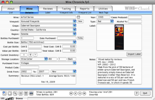
The interface was similar to the tabbed design found on Apple.com. The information is grouped into logical sections and makes navigation quick and easy and most importantly, does not overwhelm the user. The Apple website has been consistently praised as one of the easiest to use and cleanest designs around. Several interface styles were prototyped, this one was the favourite.
I went back and talked to other people about what additional features they would want in a wine database. Feedback was analyzed and much of it was incorporated. Reporting features were added, expanded search, additional fields and other tweaks.
Step 3: Testing & Release
Wine Chronicle was put out to a small group of users for beta testing; focussing on workflow, usability and interface. Again, feedback was analyzed, prioritized and the incorporated into the program. A final round of testing was done and then the software was released to the public.What was learned?
Creating a distributed application adds complexity to a project. There is no or very limited control over what kind of computer the end-user will have. This can unfortunately mean making compromises in order to meet the needs and requirements of as large an audience as possible. For example, the Wine Chronicle window is designed to work in an 800 x 600 screen resolution. When the first version of WC was created, 800 x 600 still made up a significant percentage of the screens out there. In January 2001 55% of computers ran at 800 x 600. As of January 2009 that number had plummeted to 4%. Future versions of WC will support a higher screen resolution.Issuing bug fixes is another issue. We had to build in coding that would ensure that all of the user's data was backed up and restored properly. Maintaining data integrity across multiple versions of the software is key to keeping the end-user happy.
Supporting various operating system versions is a common problem with distributed applications. Wine Chronicle supports at least 6 versions of Microsoft Windows and 6 of the Mac OS (both OS 9 and OS X).
The ability to do as much research as possible is key. There are several areas in the current version of Wine Chronicle that I would have designed differently from a wine collectors point of view.
Need more information? Contact A Poke In The Brain today
